The laws of UX that explain why your site doesn't convert.
In the first part we saw how the brain perceives and organizes information, now it's time to understand what happens next: how it decides, how long it waits... and why a user can make a decision in mere milliseconds, so keep reading to find out more.


Image from Laws of UX https://lawsofux.com/es/cards/
Digital patience is shorter than we think. If an interface responds in less than 400 milliseconds, the brain feels it instantaneously; it doesn't wait, hesitate, or lose focus. That's the Doherty's threshold: when the system and user interact almost in real time, the feeling is one of fluidity and control, but even a small delay is enough to break the rhythm: friction appears, distraction sets in, and often, abandonment.
That's why good UX doesn't just design screens: it designs speed perception. Google starts showing results while you're still typing, skeleton screens simulate that everything is already loading, and progress bars move fast at the start to give you a sense of constant movement. It's not just cosmetic; it's the Response Time Psychology.
In the digital world, waiting feels eternal, and every extra second comes at a cost.
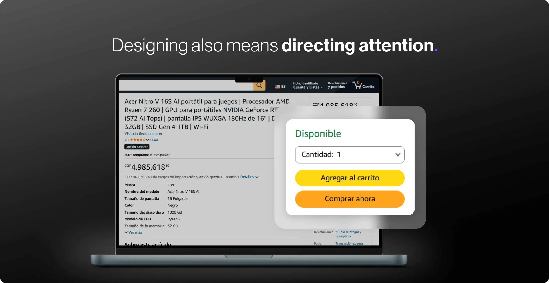
Here comes the uncomfortable truth: Every digital product is complex. The difference is Who pays for that complexity. The user or the system?
Tesler's Law makes it clear: complexity is not eliminated, it just moves.
You can ask the user to fill out 20 fields on your form, or you can reduce that complexity with autofill options. The important thing is that most of the burden is removed from users through design and development.
Users make mistakes, misspell, play where they shouldn't. A good interface doesn't punish those errors: it anticipates them and resolves them.
Postel's Law reminds us that we must be empathetic, flexible and tolerant of any of the various actions that the user performs, so anticipating their needs in terms of input, access and capacity makes the experience more user-friendly, while providing them with a reliable and accessible interface.
No one wants to feel like a task takes forever. Dividing long processes into small steps makes moving forward feel fast, even when the heavy lifting happens behind the scenes.
Parkinson's Law proposes to reduce the length of time it takes to complete a task, as opposed to what users expect it to take, and this will improve their overall experience. So let the heavy lifting happen behind the scenes.
Magic happens when the user doesn't even notice it.
The human mind is not made to process chaos, but rather clear patterns. This is why we tend to better understand what is simple, what is ordered and what is structured. That is what the Prägnanz's law: When an interface reduces visual noise, information becomes easier to interpret with almost no conscious effort. It's not about “pretty minimalism”, but about practicality. The clearer the form, the faster we understand what to do.
A classic example is the Olympic Games logo: we don't see a complex and irregular shape, but five intertwined circles. Therefore, the use of simple geometric shapes for icons and buttons helps us process information more quickly than detailed or complex shapes.
A good experience should not only be clear: it should also gently push towards action. We move forward with more confidence when we see that we are making progress (Psychology of Motivation, Attention and Retention), as is the case in learning applications such as Duolingo that show constant progress bars, step-by-step checkouts or the “3 of 4 completed” that motivate us to finish.
In addition, we don't remember the whole experience equally, but rather its most intense moments and its closure. A simple, quick and satisfying ending, such as “Done, your purchase was successful!” , can define the entire perception of the product.
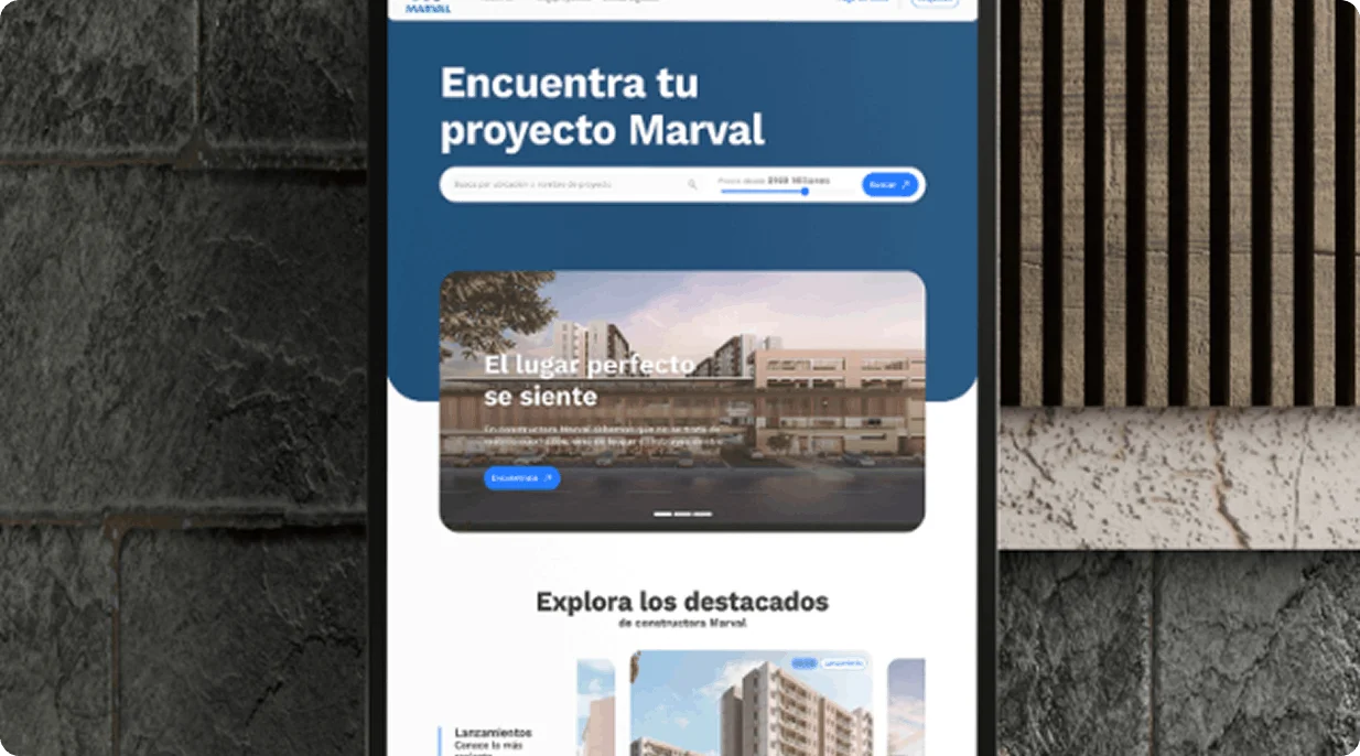
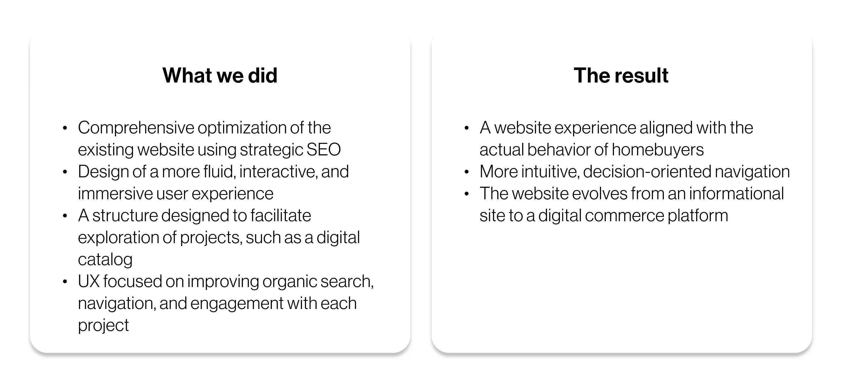
When Theory Becomes Practice: Marval Success Story

The challenge was to transform the page experience into a real estate e-commerce:
The objective was not to “make it prettier”—although it is quite attractive—but to apply behavioral psychology to design. That is, first understand how the user thinks, and then design the interface.
.webp)
.svg)


.svg)
.svg)

.svg)